Redesign of the Spotify Home Screen
Adrian
20 Sep 2018
•
2 min read
Spotify is one of my favorite apps of all time, through which I was able to discover more music that I like.
However, as much as I like how easy Spotify has made it to search for music and get legit recommendations, one major fact is still bothering me till this day:
###“I simply don’t use their home screen enough!” or “I still haven’t figured out how to use the home screen!”
But why? Here are some of my thoughts:
1. Too much scrolling
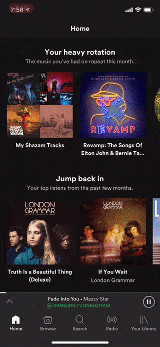
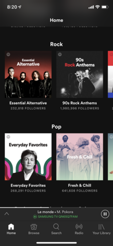
First, I think lengthy scrolling allows for too many options (15 in total), and too many options makes it hard for the user to choose, and raises their anxiety. In the long-term, they’d simply abandon the home screen, especially for Spotify’s case, where without the home screen, users can still use the app with no complaints.
Second, lengthy scrolling makes it hard to find the target. Users have to scroll two full-screen size lengths to get to their “Recently Played” every time! It’s already screaming bad design. “Recently Played” is available in “Your Library” screen, but if the user wants to access it through the home screen, it isn't that accessible, and it only adds frustration.
Third, lengthy scrolling makes it easier to jump over content in the middle because we all know people’s focus point is always at the beginning, and end.
To make all these worse, the titles are relatively tiny, and there’s no separation between each session. It becomes frustrating and confusing very quickly if users are not taking their time to scroll slowly and look through the content.
2. Still, too much scrolling (horizontal this time)
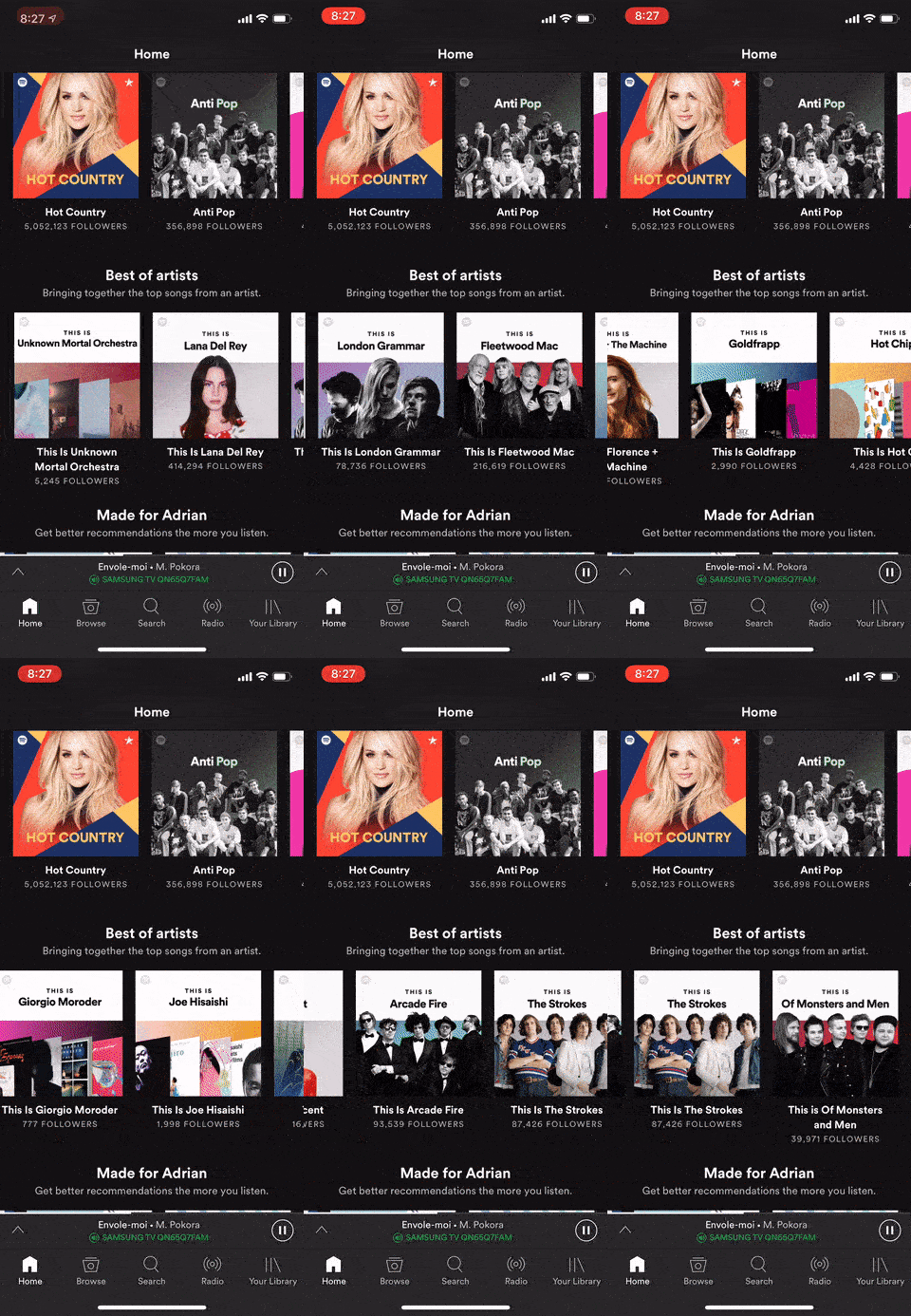
Just when you think you’ve finally found the topic you’re interested in. Here comes more scrolling! And horizontal scrolling is even worse because scrolling horizontally is less efficient due to the fact phone width is way shorter than the length and is uncomfortable for your finger!
Check out below and look at all the beautiful artwork you probably would never be able to see, because, at this point, you’re really tired of scrolling.
Now the question is: how can we make it better?
The answer is simple: make scrolling significantly less.
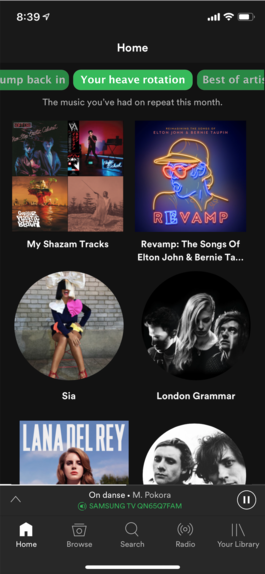
By adding a top scroll horizontal bar as shown below, scrolling can be reduced without having to compromise the content.
Why is this a better design?
First, even though we still have 15 topics, they’ve been concentrated to the top area and made easier to identify and quicker to scroll through. What’s better, each topic now has its own dedicated page, cleanly separated from each other.
Second, each topic now has more space, a full phone screen size to display more artwork. The number of artwork quickly tripled, from 2 in one screen to 6, thus reducing the total times the user has to scroll.
Third, more images are shown and less text, which makes the app more visually appealing.
Fourth, from the point of view of a developer, it would also be easier to implement if at some point, we decide to add a feature of preselecting a topic for the user based on their activities or preference.
WorksHub
Jobs
Locations
Articles
Ground Floor, Verse Building, 18 Brunswick Place, London, N1 6DZ
108 E 16th Street, New York, NY 10003
Subscribe to our newsletter
Join over 111,000 others and get access to exclusive content, job opportunities and more!


