Image Optimisation for the Modern Web
Abhinav Anshul
26 Apr 2022
•
5 min read

The modern web has evolved tremendously over the past decade. Each web page now involves high-quality media content, it could be a simple image or a complex 3D animation. Such high-quality media integration takes a toll on web performance if done poorly. In this article, we will look at some of the best practices adopted around the web to make a user experience as smooth as possible. Further, we will explore some popular libraries and framework that solves this issue.
The Image Tag:
The prevalent img tag is the defacto way of rendering an image on the web. A simple image element can look something like this :
<img src="./flower.png"/>
The only parameter required for an img tag to work is the image itself or a path referencing that image. Widely supported formats include jpeg, gif, png, svg, webp, avif etc.
Issues with Layout Shift
Cumulative Layout Shift or CLS in short is one of the dominant metric that is used by Lighthouse and other Web standards to judge page performance. Layout Shift can be can either :
- Intended: Element shifts on the page when the user is interacting and is expected.
- Un-intended: Element shifts without the user interaction at all, causing weird behaviour.
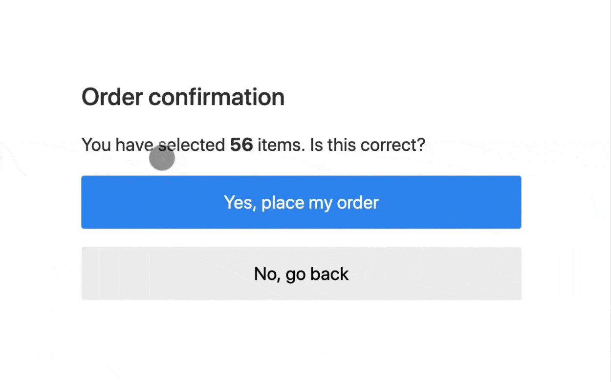
Here's an interesting example that shows why you need to keep CLS to as minimum, as possible.
Poor CLS is caused by and not limited to:
- Image/Video elements without dimensions
- Dynamically injected data
- Fonts loading without a fallback
We will focus on the first point, in terms of image rendering, always explicitly mention its width & height to prevent CLS, as it leaves the space empty while the image is loading, instead of shifting the layout once the image gets downloaded. By default, the units are in pixels(px) if not mentioned at all.
<img
  alt="A picture about flower"
  src="./flower.png"
  width="250"
  height = "250"
/>
Keep in note that mentioning an "alt" is always a good idea both in terms of accessibility or describing an image beforehand.
Improvising Performance
To enhance image rendering on the page, the img tag has exposed a couple of APIs. Now, all major browser supports lazy loading natively.
<img loading="lazy" src="flower.png" />
Lazy loading ensures the image will only be downloaded once it appears on the user viewport. The other value, "eager" does the quite opposite, i.e loads all image at once.
<img loading="eager" src="flower.png" />
Apart from loading, img element also exposes a decoding attribute, that helps the browser while painting the screen.
The decoding attribute takes either sync or async as its value. By default, it is set to 'auto' letting the browser decide what's best in each case.
decoding= "async" ensures the image is yet to be decoded in the background while the rest of the page content can be rendered upfront(for example the text content). In the other case decoding="sync" makes sure images are not deferred in the background and everything (image + text content) will be loaded, once the image has been downloaded.
Using Modern Formats:
Modern web ecosystem has a variety of image formats to choose from. But are all those formats equally competent when it's judged in terms of size, loss of pixels while compressing? Well not quite!
It is always advisable to use modern image formats like AVIF or WebP whenever possible. In Google's own words(that developed WebP format),
“a modern image format that provides superior lossless and lossy compression for images on the web. Using WebP, webmasters and web developers can create smaller, richer images that make the web faster."
Coming to AVIF, It can compress up to 10 times the image while maintaining the image quality at par with that of png.
Unfortunately, due to not much awareness, modern formats like WebP or AVIF are still not popular, while png, jpg etc continue to dominate the web. It will still take a couple of years for these comparatively new formats to capture developer space widely.
Utilising Placeholder:
This one is more of a perf trick rather than a concept. The strategy is to replace the actual image with a placeholder. While the image is loading, the placeholder will be shown. This can be done with the help of CSS properties, i.e setting a background image.
<img
  src="flower.jpg"
  width="250"
  height="250"
  loading="lazy"
  style="background-image :
          url(data : image/svg+xml ; base64);
         background-size : cover"
/>
As you can see, the background image is a low-res Base-64 version of an image. It can be loaded very quickly.
Adding necessary fallbacks:
Adding "srcset" to an img tag can help the browser pick the best available set of images provided.
<img
  src="flower.webp"
  srcset="flower-small.webp 400vw, flower-large.webp 800vw"
  sizes="(max-width : 600px) 400px, 800px"
/>
Here, the sizes attribute lists a set of conditions on which the browser would pick up the best image dimension to render. In the above case, when the viewport is less than or equal to 600px, then it is ideal to pick up the "flower-small.webp" image, else it would pick up " flower-large.webp"
Levaraging CSS content-visiblity:
<section style="content-visiblity : auto;">
  <img src="flower.avif"/>
</section>
content-visibility when set to a div or a section of a page can delay the rendering. If a large section of media-rich content is off the screen, then there is no need to load everything upfront, hence improving some perf bottlenecks.
Using Third-Party Libraries:
To not keep re-inventing the wheel, popular JavaScript Libraries/Framework provides their own image API that is nonetheless sugarcoated over the img element but with a much nicer API & error handling. A few popular ones,
- NextJS - An Image component is provided and recommended by the Nextjs team to use over 'img' tag.
import Image from 'next/image'

<Image
  loader={<LoaderComponent />}
  src="flower.png"
  alt="Picture of a flower"
  width={250}
  height={250}
/>
NextJS from the beginning has focussed on its developer experience. Here, the "Image" component would throw a warning in case alt has been skipped, also suggests making width & height mandatory fields that further reduce CLS issues. It also exposes a loader attribute that is not available in the native image element. It ensures to place a loader until the image has been loaded 100%. Loaders can be spinners or any fancy custom animation component.
- Svelte: While working with svelte, although there isn't a top-level API for images, however, the svelte team does recommend using a third-party package when dealing with images. With over 500+ stars and wide community adoption, this can be quite useful.
Similarly, there are well supported third-party libraries if not a top-level API already included in similar JavaScript libraries like Angular, SolidJS, Astro, etc.
Wrapping Up:
In this article, we learnt how images or media in general impact the overall page performance. There are many good rendering techniques if done correctly can improve user experience, and reduce the bundle side of the codebase as well. we also saw how popular frameworks like Next, Svelte provide or recommend a certain API to deal with images on the web. Further, we read about some modern image formats, that do lossless compression and preserve image quality.
Some Important Resources that I have collected over time:
- https://developer.mozilla.org/en-US/docs/Web/HTML/Element/img
- https://www.industrialempathy.com/posts/image-optimizations/
- https://www.smashingmagazine.com/2021/09/modern-image-formats-avif-webp/
Loved this post? Have a suggestion or just want to say hi? Reach out to me on Twitter
WorksHub
Jobs
Locations
Articles
Ground Floor, Verse Building, 18 Brunswick Place, London, N1 6DZ
108 E 16th Street, New York, NY 10003
Subscribe to our newsletter
Join over 111,000 others and get access to exclusive content, job opportunities and more!