How to Customise Material UI's Default Styling
Damilola Adedoyin Ezekiel
29 Jul 2021
•
7 min read

Material UI is a very great library as we've discussed previously, and one of its best features is the easy and efficient customization. Although material UI provides default styling and this can be found in the documentation, we can still override the default styling by providing our own custom styles and this is a very important thing to know how to do because without custom styling, every site built with Material UI will have the same look and this is not really what we're trying to achieve.
There are different approaches as to how you can customize or override Material UI components default styling. Below are the three (3) common ways we can customize Material UI's element:
-
withStyles
-
ThemeProvider
-
makeStyles
All the methods above are very valid but sometimes it gets confusing as to when and where they are supposed to be used. In this article, we will be tackling all these issues.
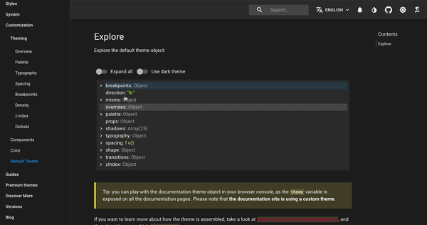
If you check out the material UI documentation for default themes, you'd actually see a list of the themes that can be customized. Here are some of the themes:
-
Palette: Palettes enable you to alter the color in your material UI component. The palette color comes in different forms: Primary, Secondary, Error, Warning, Success, Info. Each of these color palettes comes in three variations which are "light, main and dark". The "main" color is usually the default color.
-
Spacing: Spacing is used to give consistent distance between elements UI. Spacing can be applied to our UI by using "theme. spacing()". Material UI uses a default of 8px scaling factor and this means that whatever value you're using for your spacing is multiplied by 8.
example:
theme.spacing(5) // 5*8 which gives a total spacing of 30px
You can also provide a shorthand method for the spacing, for example, if we're to style a margin we can add values for the top, right, bottom, and left instead of using one value for all.
margin : theme.spacing(2, 5, 6, 8)
-
Typography: Typography is the technique of making words legible, readable, and appealing when displayed. It also has different variants which are " h1", "h2", "h3", "h4", "h5", "h6", "body1", "body2", "subtitle1", "subtitle2". All these variants can be customized to suit your UI.
-
BreakPoints: Breakpoints are used to make components responsive. It is also used to control the layout of the entire application. Material UI has five default breakpoints which are xs, sm, md, lg, xl. CSS media queries are also a way to make our breakpoints more responsive. It provides four styles to achieve this:
-
theme.breakpoints.up(key)
-
theme.breakpoints.down(key)
-
theme.breakpoints.only(key)
-
theme.breakpoints.between(start, end)
The default breakpoints are provided as keys for the media queries. example
theme.breakpoints.up(lg) // This means you want to apply the styling on a device that has the large breakpoint and above.
OVERRIDE MATERIAL UI DEFAULT STYLING
Theme Provider
Theme provider is one of the ways we can use to override material UI's default styling. Although material UI comes with a default theme, the ThemeProvider component is used to inject a customized theme in our UI.
CreateTheme (formerly createMuiTheme) is a function that is assigned to a variable ( we can call it "theme" or any other name, but the theme is usually what you'll see in most blogs or videos)and it is used to create themes in addition to using the ThemeProvider component. The function takes in an object as an argument, representing the theme that we want to create.
example 1:
import { Button } from "@material-ui/core";
import { createTheme, ThemeProvider } from "@material-ui/core/styles";

const theme = createTheme({
  palette: {
    primary: {
      main: # fff"
    },
    secondary :{
      main: # de2bfa"
    }
  },
});
export default function App() {
  return (
    <ThemeProvider theme={theme}>
      <Button color="primary" variant="contained">
        Hello Guys!!!!!!
      </Button>
      <Button color="secondary" variant="contained">
        Hello Guys!!!!!!
      </Button>
    </ThemeProvider>
  );
}
This example above is useful in cases where you want to use custom colors instead of material UI colors. When doing this, you have to set a default main color if not your code will throw an error.
example 2:
import { Button } from "@material-ui/core";
import { createTheme, ThemeProvider } from "@material-ui/core/styles";
import yellow from "@material-ui/core/colors/yellow";
import red from "@material-ui/core/colors/red";


const theme = createTheme({
  palette: {
    primary: red,
    secondary :yellow
  },
});
export default function App() {
  return (
    <ThemeProvider theme={theme}>
      <Button color="primary" variant="contained">
        Hello Guys!!!!!!
      </Button>
      <Button color="secondary" variant="contained">
        Hello Guys!!!!!!
      </Button>
    </ThemeProvider>
  );
This second example works if you want to use the different colors from Material UI's palette. All you have to do is import the colors needed and then use them in your createTheme function.
P.S. The primary color in material UI's palette is Blue by default and secondary is a shade of Red.
WithStyles
withStyles can be used to customize UI by using its higher-order component pattern. It does not modify the component passed to it instead, it returns a new component with a classes property.
The withStyles component takes in a function or object named styles although the function can be named anything but the most common way of naming the function is calling in styles. The styles object or function returns the custom styles that we want to use in our app. After doing this we now pass classes as a prop to our react component as this will enable us to use it as a value for className. For instance, our component is named Header we will then pass classes into it as a prop.
function Header({classes}){
   //block of code
}
Here's an example of how withStyles can be used to customize material UI default styling. Notice how I named my function color instead of the usual styles
import { Grid, Typography } from "@material-ui/core";
import {withStyles} from "@material-ui/core/styles";


const color = {

  firstgrid:{
    backgroundColor:"blue",
    color:"white",
  },
  secondgrid:{
    backgroundColor:"yellow",
  },
  thirdgrid:{
    backgroundColor:"orange",
    color:"white",
  },
  lastgrid:{
    backgroundColor:"pink"
  },
};

function App({classes}) {
  return (
    <Grid container className={classes.text}>
      <Grid item xs={12} md={6} className={classes.firstgrid}>
        <Typography >This is the first grid </Typography>
      </Grid>
      <Grid item xs={12} md={6} className={classes.secondgrid}>
        <Typography>This is the second grid</Typography>
      </Grid>
      <Grid item xs={12} md={6} className={classes.thirdgrid}>
        <Typography>THis is the third grid</Typography>
      </Grid>
      <Grid item xs={12} md={6} className={classes.lastgrid}>
        <Typography>This is the last grid</Typography>
      </Grid>
    </Grid>
  )
};

export default withStyles(color)(App);
withStyles is a very flexible and easy way of styling our components as it does not require so much effort.
makeStyles
This is my favorite way of customizing Material UI components and I'll show you why. Material Ui has support for hooks. It provides a hook that we can use with makeStyle to style our component, awesome!!! isn't it?.
makeStyles allows you to pass in an object containing different classes that contains all the styling needed in our app. When you use makeStyles, you set it to a hook named useStyles(you can really name it anything but the norm is useStyles), then you can useStyles in your application by assigning it to a variable called classes which you can now pass as a value of className and what this does is that it allows makeStyles generate all the styling and classes that have been passed into it as objects.
import { Button } from "@material-ui/core";
import { makeStyles } from "@material-ui/core/styles";

const useStyles = makeStyles({
 btn1: {
    backgroundColor: "blue",
    color: "white",
    "&:hover":{
      backgroundColor:"red"
    }
  },
  btn2: {
    backgroundColor: "green",
    color: "white",
    "&:hover":{
      backgroundColor:"pink"
    }
  },
  btn3: {
    backgroundColor: "purple",
    color: "white",
    "&:hover":{
      backgroundColor:"black"
    }
  },

});

function App() {
  const classes = useStyles();
  return (
    <>
    <Button variant="contained" className={classes.btn1}>First button</Button>
    <Button variant="contained" className={classes.btn2}>Second Button</Button>
    <Button  variant="contained" className={classes.btn3}>Third button</Button>
    </>
  );
}

export default App;
Another cool thing about makeStyles is that it also allows us to inject material UI's theme directly into our hook by turning and we can do this by turning makeStyles hook into a function that returns an object. This does not in any way alter our styling instead it enhances it by allowing us to combine both our custom style together with Material UI theme.
example:
import { Button, TextField, Grid, CardMedia } from "@material-ui/core";
import { makeStyles } from "@material-ui/core/styles";
import login from "../public/login.svg";

const useStyles = makeStyles((theme) => ({
  avatar: {
    margin: theme.spacing(1)
  },
  form: {
    marginTop: theme.spacing(1),
    padding: theme.spacing(5)
  },
  submit: {
    margin: theme.spacing(3, 0, 2),
    background: # F12D77",
    color: # fff"
  },
  continue: {
    margin: theme.spacing(3)
  },
  grid: {
    background: # fffff",
    boxShadow: "0 8px 32px 0 rgba( 31, 38, 135, 0.37 )",
    borderRadius: "20px",
    paddingTop: theme.spacing(5),
    [theme.breakpoints.up("md")]: {
      height: "70vh"
    }
  }
}));

function App() {
  const classes = useStyles();
  return (
    <Grid
      container
      className={classes.grid}
      justifyContent="center"
      alignItems="center"
    >
      <Grid item xs={7} md={5}>
        <CardMedia title="login" image={login} component="img" />
      </Grid>
      <Grid item xs={12} md={7}>
        <form className={classes.form}>
          <TextField
            variant="outlined"
            margin="normal"
            required
            fullWidth
            name="Email "
            label="Email"
            type="text"
            autoComplete="Email"
          />
          <TextField
            variant="outlined"
            margin="normal"
            required
            fullWidth
            name="password"
            label="Password"
            type="password"
            autoComplete="current-password"
          />

          <Button
            type="submit"
            fullWidth
            variant="contained"
            className={classes.submit}
          >
            Sign In
          </Button>
        </form>
      </Grid>
    </Grid>
  );
}

export default App;
From the code sample above, you can see that I was able to use Material UI's themes like spacing and breakpoint to modify our code although we would have been able to achieve the same result without the themes but using it makes us write lesser code and also utilize resources given to us by material UI.
You can find the final result of the demo in my codesandbox
In addition to using these styling methods individually, you can also combine two of them in your application depending on what you're trying to achieve or how complex your application is. Although, most times one of them is usually enough to do what you want. See the demo below for more clarification.
import {
  AppBar,
  Container,
  Grid,
  IconButton,
  Toolbar,
  Typography,
  Button,
  makeStyles,
  CssBaseline,
  createTheme,
  ThemeProvider,
  CardMedia
} from "@material-ui/core";
import MenuIcon from "@material-ui/icons/Menu";
import purple from "@material-ui/core/colors/purple";

import image from "../public/image.svg";

const theme = createTheme({
  palette: {
    primary: purple,
    secondary: {
      main: # 000"
    }
  },
  typography: {
    h3: {
      fontSize: "2.5rem"
    },
    h4: {
      fontSize: "2rem"
    }
  }
});

const useStyles = makeStyles((theme) => ({
  container: {
    marginTop: theme.spacing(5),
    display: "flex",
    justifyContent: "center",
    alignItems: "center"
  },
  appBar: {
    backgroundColor: # fffa",
    borderBottom: "1px solid purple"
  },
  title: {
    flexGrow: 1
  },
  heroHeader: {
    marginBottom: theme.spacing(5)
  },
  btn: {
    marginTop: theme.spacing(5)
  }
}));

export default function App() {
  const classes = useStyles();
  return (
    <ThemeProvider theme={theme}>
      <Container disableGutters maxWidth={false}>
        <CssBaseline />
        <AppBar position="static" className={classes.appBar} elevation={0}>
          <Toolbar>
            <IconButton color="primary">
              <MenuIcon />
            </IconButton>
            <Typography
              variant="h4"
              color="secondary"
              className={classes.title}
            >
              Material UI
            </Typography>
            <Button variant="contained" color="primary">
              Sign In
            </Button>
          </Toolbar>
        </AppBar>
        <Grid container spacing={5} className={classes.container}>
          <Grid item xs={12} md={7}>
            <Typography
              variant="h3"
              color="primary"
              className={classes.heroHeader}
            >
              Learning Material UI
            </Typography>
            <Typography color="secondary">
              Lorem ipsum dolor sit amet, consectetuer adipiscing elit. Aenean
              commodo ligula eget dolor. Aenean massa. Cum sociis natoque
              penatibus et magnis dis parturient montes, nascetur ridiculus mus.
            </Typography>
            <Button variant="contained" color="primary" className={classes.btn}>
              Learn More
            </Button>
          </Grid>
          <Grid item md={5}>
            <CardMedia title="login" image={image} component="img" />
          </Grid>
        </Grid>
      </Container>
    </ThemeProvider>
  );
}
Here's the link to the codepen.
WorksHub
Jobs
Locations
Articles
Ground Floor, Verse Building, 18 Brunswick Place, London, N1 6DZ
108 E 16th Street, New York, NY 10003
Subscribe to our newsletter
Join over 111,000 others and get access to exclusive content, job opportunities and more!